In the ever-evolving world of branding and design, simplicity and clarity have become paramount. As companies strive to stay relevant and resonate with their audiences, many have turned to minimalist design principles to refresh their brand identities. Minimalism, characterized by clean lines, simple shapes, and a focus on essential elements, helps brands cut through the visual clutter and communicate more effectively. In this article, we explore ten prominent companies that have successfully rebranded themselves with minimalist design. From tech giants to fast-food chains, these examples showcase the power of simplicity in creating modern, memorable, and versatile brand identities.
1.Google
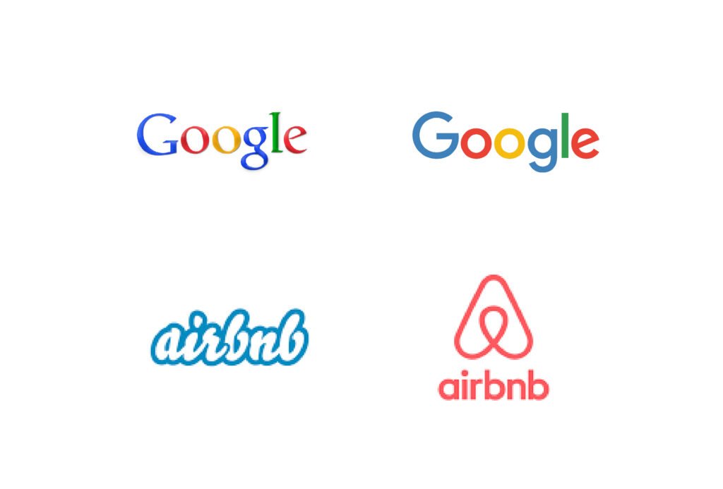
In 2015, Google introduced a minimalist redesign of its logo. The new logo features a simple, sans-serif typeface that is more modern and clean compared to its previous serif font. The colors remained the same but were brightened, and the overall design was simplified to improve readability and adaptability across various devices and screen sizes.
2.Airbnb
In 2014, Airbnb unveiled a new logo and brand identity. The redesign featured a minimalist symbol called the “Bélo,” which is a simple, abstract icon representing belonging. The typeface was also updated to a clean, sans-serif font, and the overall look was modernized to reflect the brand’s global and digital presence.

3.Mastercard
In 2016, Mastercard underwent a significant rebranding effort. The new logo retained the iconic overlapping red and yellow circles but removed the word “MasterCard” from the center, simplifying the design. The typeface was updated to a clean, modern sans-serif font, emphasizing simplicity and digital adaptability.

4.Spotify
Spotify has made several tweaks to its logo over the years, with the most notable changes embracing minimalism. The most recent redesign simplified the logo to a single color (green) with a clean, modern sans-serif font. The iconic sound wave symbol was retained but stylized to be more streamlined and minimalistic.
5.Yahoo
In 2019, Yahoo introduced a new minimalist logo as part of its rebranding efforts. The new design featured a simple, lowercase sans-serif typeface with a slight tilt to the exclamation mark, creating a modern and approachable look while maintaining the brand’s playful identity.
6.Dropbox
In 2017, Dropbox unveiled a new logo and brand identity that focused on minimalism. The redesigned logo featured a simplified, flat version of the iconic box symbol and a new, clean sans-serif typeface. The overall aesthetic was modern and straightforward, aligning with the company’s focus on simplicity and productivity.
7.Burger King
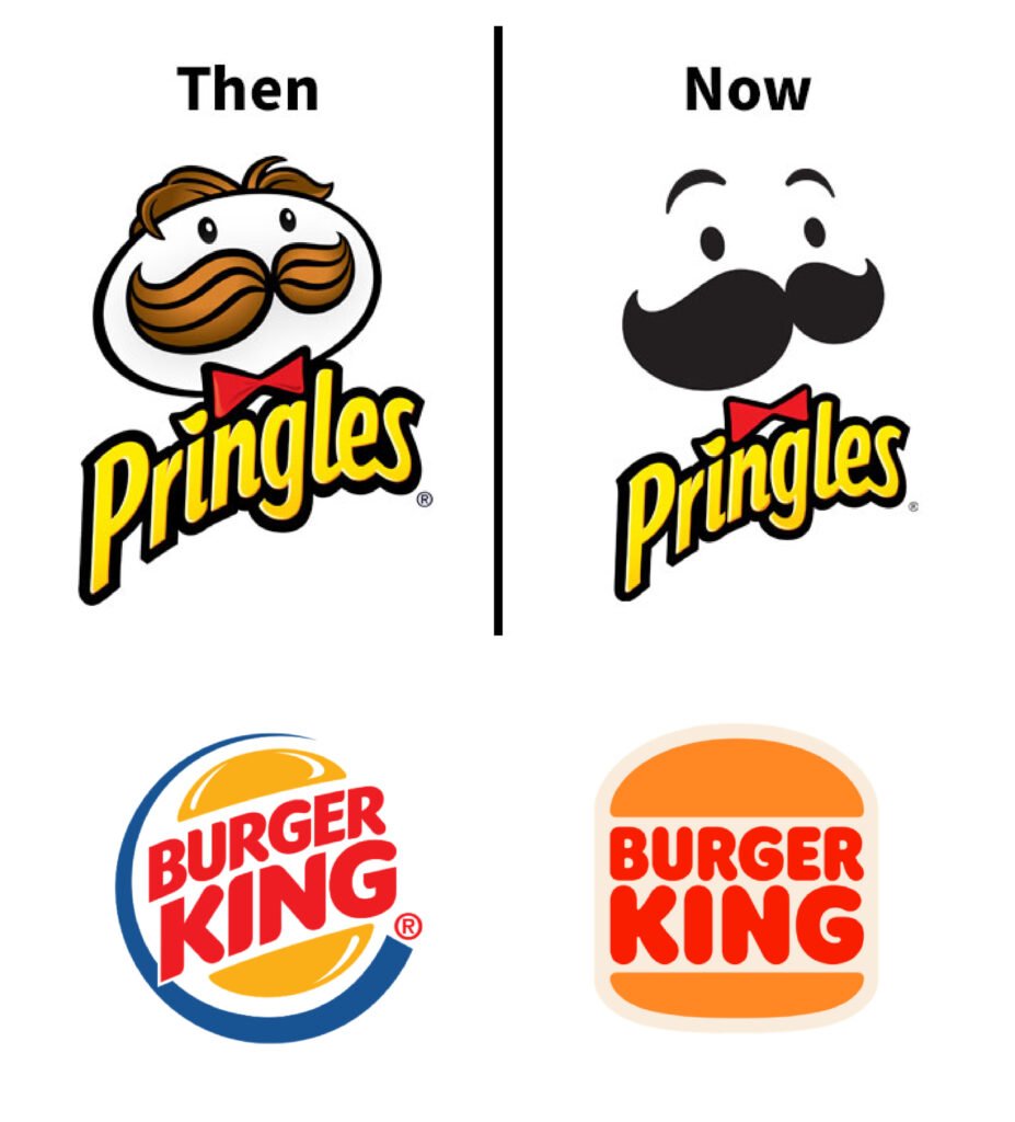
In 2021, Burger King reverted to a more minimalistic version of its classic logo from the 1970s and 1980s. The new design features a simplified, flat version of the previous logo, with the bun and the company name in a clean, rounded sans-serif font. The rebranding effort emphasized simplicity, nostalgia, and a return to the brand’s roots.
8.Pringles
Pringles redesigned its logo in 2020, opting for a more minimalist approach. The new logo featured a simplified version of the Mr. Pringle character, with fewer details and a flatter design. The typeface was also updated to a modern, clean sans-serif font, creating a more contemporary look.

9.BMW
In 2020, BMW introduced a new logo that embraced minimalism. The redesigned logo featured a flat, transparent design with a simplified version of the iconic roundel. The new logo was intended to be more digital-friendly and reflect the brand’s transition towards a more modern and forward-looking identity.
10.Mozilla Firefox
Mozilla Firefox has undergone several rebrands, with the most recent in 2019 embracing minimalism. The new logo features a simplified, abstract representation of the iconic fox and globe, using flat design principles and vibrant colors. The overall look is clean, modern, and versatile for digital platforms.
The shift towards minimalist design in branding reflects a broader trend of prioritizing clarity, functionality, and adaptability in an increasingly digital world.. By stripping away excess details and focusing on essential elements, these brands have not only modernized their visual identities but also enhanced their ability to connect with audiences across diverse platforms. Minimalist design isn’t just about aesthetics; it’s about creating a cohesive, memorable, and efficient brand experience that stands the test of time. As these examples show, sometimes less truly is more.

