Starbucks, the global coffeehouse giant, offers a compelling example of brand identity evolution. Founded in 1971, Starbucks has undergone several logo transformations, each reflecting a shift in its brand strategy and market positioning. Let’s explore how and why these changes were made, and what they tell us about the company’s journey.
The Original Logo (1971): A Nod to Heritage
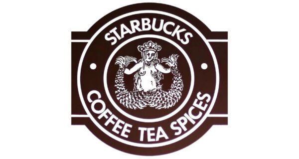
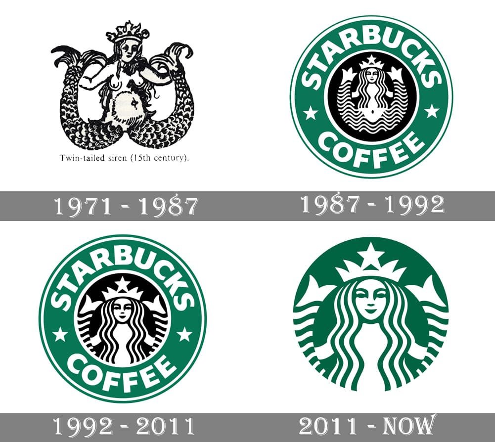
The original Starbucks logo was a detailed, brown emblem featuring a twin-tailed mermaid, or siren, inspired by Greek mythology. The design was intricate and had a rustic feel, aligning with the brand’s early focus on providing high-quality coffee beans and a nod to the seafaring traditions of coffee traders. The siren, encircled by the company’s full name—“Starbucks Coffee, Tea, and Spices”—symbolized the brand’s connection to the historic coffee trade.

The First Redesign (1987): Simplification and Expansion
As Starbucks began to expand beyond Seattle and entered new markets, the brand recognized the need for a more contemporary and scalable identity. The 1987 redesign simplified the logo by switching to a cleaner, more modern black-and-white color scheme and tightening the siren’s details. The company name was shortened to “Starbucks Coffee,” reflecting a focus on their core product. This iteration of the logo retained the iconic siren but made it more versatile and easier to reproduce across various media.

The 1992 Redesign: Emphasizing the Core Product
By 1992, Starbucks was rapidly expanding, and the brand’s leadership decided to further emphasize the coffee aspect of its business. The logo was refined to make the siren more prominent, with her scales and details becoming more stylized. The outer circle of the logo, now green—a color associated with growth, freshness, and prosperity—was kept, with the company name prominently displayed around it. This version of the logo solidified Starbucks’ visual identity and became one of the most recognizable symbols in the world

The 2011 Redesign: The Siren Takes Center Stage
As Starbucks continued to evolve into a global brand offering more than just coffee, it embarked on its most significant logo redesign in 2011. This time, the company made a bold move by removing the text entirely and allowing the siren to stand alone. The siren was slightly refined to appear more symmetrical and modern, but the overall look remained true to the brand’s heritage. This textless logo reflected Starbucks’ confidence in its brand equity and its desire to transcend the coffee category, signifying its evolution into a broader lifestyle brand.

Lessons from Starbucks’ Brand Evolution
Starbucks’ logo evolution offers several key insights into the process of rebranding and the importance of staying true to a brand’s core values while adapting to change.
Consistency with Flexibility: Each redesign maintained a connection to the original logo, ensuring brand recognition, while also adapting to the company’s changing focus and market expansion. The siren remained a consistent element, but its presentation evolved to match Starbucks’ growth.
- Simplification for Impact: Over time, Starbucks’ logo became simpler, more streamlined, and easier to reproduce across various platforms. This shift reflects a broader trend in logo design toward minimalism, where simplicity often enhances memorability and versatility.
- Embracing Change: The bold decision to remove the company name from the logo in 2011 signified a major shift in Starbucks’ identity, reflecting its confidence in the brand’s global recognition. It also indicated a broader shift in the company’s strategy, moving beyond coffee into other areas such as retail and lifestyle.
- Cultural and Market Sensitivity: Each iteration of the logo was influenced by the cultural and market context of the time. The switch to green in 1992 tapped into environmental and health-conscious trends, while the move to a textless logo in 2011 reflected a modern, global aesthetic.

The evolution of Starbucks’ logo is a testament to the power of thoughtful, strategic design in shaping a brand’s identity over time. By carefully balancing consistency with innovation, Starbucks has managed to maintain its brand relevance and resonance across decades. This case study underscores the importance of aligning visual identity with a company’s mission, market positioning, and long-term goals. For businesses considering a rebrand, Starbucks offers a blueprint for how to navigate the delicate process of evolving a brand identity without losing sight of its essence.

