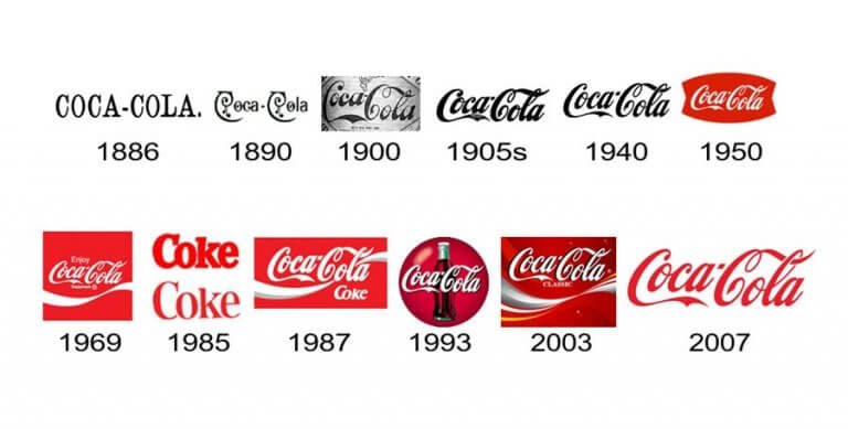
Coca-Cola’s brand identity has become synonymous with nostalgia, tradition, and a global sense of joy. Starting as a medicinal soda in 1886 Atlanta, Coca-Cola’s journey is one of careful, bold evolution. The logo has adapted over the decades, embracing changes in society and consumer behavior while maintaining its unmistakable essence.
The earliest Coca-Cola logo was based on the Spencerian script, a handwritten style popular at the time. This elegant script set a tone of warmth and familiarity, drawing consumers in with a promise of refreshment. Over the years, the logo saw refinements to its curves and weight, each iteration reinforcing the brand’s charm. By the 1940s, Coca-Cola’s identity had embedded itself globally, and the red-and-white color scheme, now iconic, became associated with happiness and celebration.
A pivotal moment in Coca-Cola’s branding history was the introduction of “New Coke” in 1985, an attempt to reformulate the classic taste. The backlash from loyal customers underscored the emotional depth of brand loyalty—people didn’t just consume Coca-Cola; they felt a profound attachment to it. This episode marked the importance of identity in branding, showing that Coca-Cola’s value was as much in its iconic image as in its taste.
In recent years, Coca-Cola’s branding has stayed current with minimalist trends, adapting across digital platforms and seasonal campaigns while preserving the foundational elements that people love. With subtle logo refinements and culturally resonant campaigns, Coca-Cola continues to embody both timelessness and innovation—capturing the spirit of what made it beloved in the first place.


